
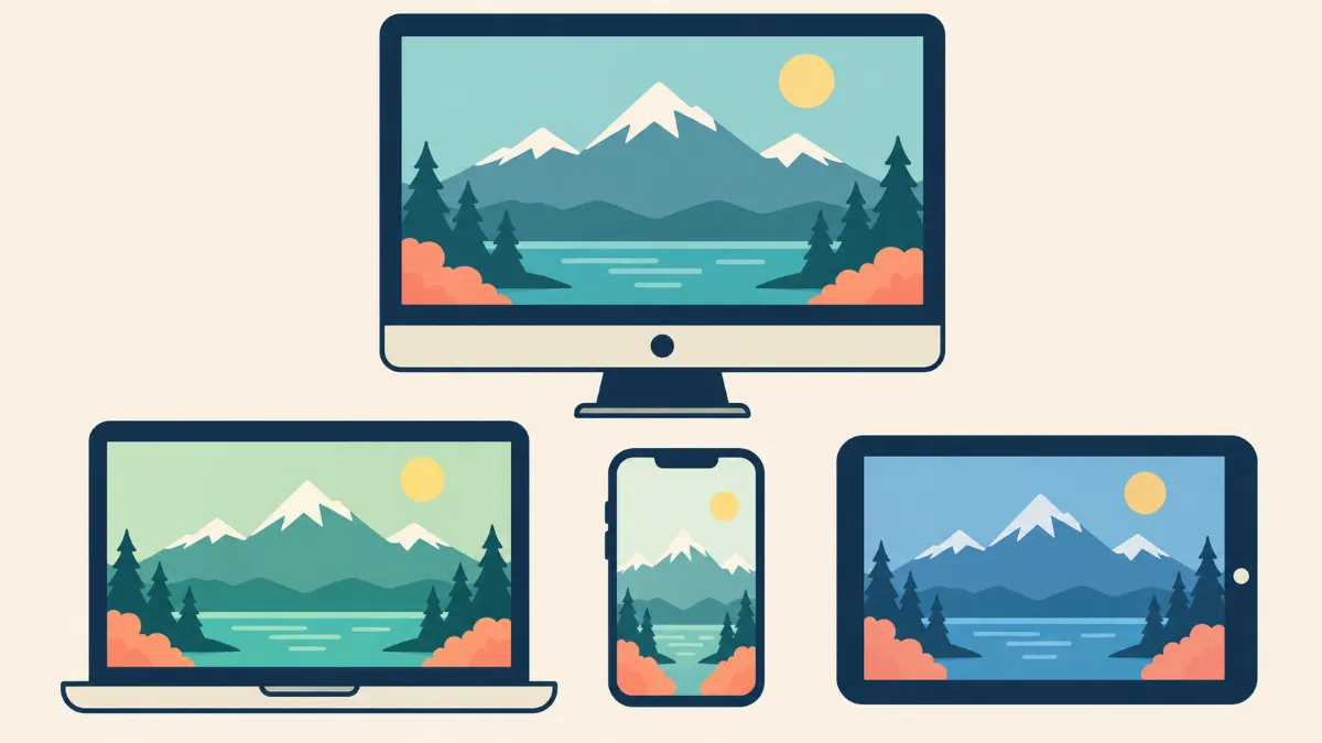
# Why Your Edited Photos Look Different on Different Screens
Have you ever finished editing a photograph on your computer, only to discover that it looks completely different when you open it on your smartphone? Maybe the colors appear warmer, the brightness looks stronger, or the shadows seem darker than they did during editing.
This is a common problem for photographers, photo editors, graphic designers, and business owners who work with digital images.
You might spend hours correcting the colors of a product photograph, only to find that the same image looks too yellow on another monitor. A portrait that appears natural on your laptop might look overly saturated on your phone.
The frustrating part is that the actual image file may not have changed at all.
Different screens display colors and brightness differently because of their hardware, display settings, color profiles, and surrounding lighting conditions.
This means that even a properly edited photograph can appear different depending on where someone views it.
For businesses, these differences can create additional concerns. Product images should represent items accurately, especially when customers rely on photographs to make purchasing decisions.
In this guide, we will explain **why edited photos look different on different screens**, how screen settings affect image appearance, and what you can do to achieve more consistent photo editing results.
Why Do the Same Photos Look Different on Different Devices?
Every digital screen has its own way of displaying images.
Although two devices may open the same photograph, they do not necessarily reproduce its colors, brightness, or contrast identically.
For example, you may edit a photograph using a desktop monitor with moderate brightness.
When you open the same image on a smartphone, the colors may appear more intense because the phone has a different display technology, color range, or screen settings.
Another laptop may display the same photograph with darker shadows or a cooler color tone.
These differences happen for several reasons:
- Different screen technologies
- Brightness and contrast settings
- Color temperature
- Display color profiles
- Screen calibration
- Color gamut capabilities
- Automatic display adjustments
- Surrounding lighting conditions
- Software color management
Even two monitors from the same manufacturer may display slightly different colors.
This is why professional photo editors pay attention to color management instead of judging image quality based only on how a photograph looks on one screen.
1. Different Screens Use Different Display Technologies
One of the main reasons edited photographs appear different across devices is that screens use different display technologies.
Common display types include LCD, LED-backlit LCD, OLED, and other variations.
Each technology has its own characteristics.
LCD Screens
LCD screens are common in laptops, desktop monitors, and other electronic devices.
Their appearance can vary depending on the panel type, backlighting, viewing angle, and manufacturer settings.
Some LCD screens provide accurate colors, while others may have limited color reproduction or less consistent viewing angles.
LED-Backlit Screens
Many modern LCD displays use LED backlighting.
These screens can provide good brightness and color performance, although the actual results depend on the display design and settings.
OLED Screens
OLED screens are found in many smartphones, tablets, and high-end monitors.
They can display deep blacks and high contrast because individual pixels produce their own light.
Some OLED devices also offer wide color gamuts and high peak brightness.
As a result, photographs may appear more vivid on certain OLED screens compared with other displays.
However, OLED does not automatically mean that a screen is more color accurate.
Accuracy depends on calibration, display settings, and color management.
For photo editing, the important consideration is not simply the screen technology but how accurately the display reproduces the intended colors.
2. Screen Brightness Changes How Your Photos Appear
Screen brightness is one of the easiest differences to notice.
Imagine editing a portrait on a laptop with its brightness set very high.
The photograph may look clear and properly exposed during editing.
However, when someone views the same image on a dimmer screen, the shadows may appear too dark.
This happens because the amount of light coming from the display affects how we perceive the image.
Editing on a Screen That Is Too Bright
If your monitor is excessively bright, you may unintentionally make your photographs darker during editing.
You might lower the exposure because the image appears too light on your display.
When the photograph is opened on another device, it may look underexposed.
Editing on a Screen That Is Too Dim
The opposite can also happen.
You may increase exposure too much because your screen is too dark.
The finished image could then appear overly bright on a more typical display.
How to Fix Brightness Differences
Use a comfortable and consistent monitor brightness when editing.
Avoid frequently changing brightness during a session.
For color-sensitive work, calibrating your monitor to a suitable luminance target is more reliable than choosing a brightness percentage by eye.
The appropriate target depends on the surrounding lighting and intended output.
Also, avoid judging the quality of a photograph on a phone that is using extremely high or low brightness.
3. Color Temperature Makes Photos Look Too Warm or Too Cool
Color temperature describes the visual warmth or coolness of a display.
A warmer screen may make white areas appear slightly yellow or orange.
A cooler screen may make the same whites appear blue.
For example, imagine editing a photograph of a white wedding dress.
On one monitor, the dress may appear neutral white.
On another screen with warmer settings, it may look slightly cream-colored.
The photograph itself may be identical.
The difference comes from how the screens display white and other colors.
Why Color Temperature Matters
When editing photographs, your eyes adapt to the appearance of your screen.
If your monitor has an unwanted color cast, you may attempt to correct that cast by changing the image.
This can introduce inaccurate colors into the actual file.
For example, if your screen is too yellow, you may add unnecessary blue tones to the photograph.
When someone views the edited image on a neutral display, it may look too cool.
How to Improve Color Temperature Consistency
Use a suitable, calibrated display white point.
D65, approximately 6500 Kelvin, is a common reference for many screen-based photographic workflows.
Some print workflows use different targets based on their viewing conditions.
Avoid changing your monitor's color temperature while working on the same editing project.
A consistent display environment makes it easier to judge colors accurately.
4. Color Profiles Affect How Images Are Displayed
Color profiles are another important reason photographs can look different across screens.
A color profile provides information that helps color-managed software interpret and display colors correctly.
Common RGB color spaces include sRGB, Adobe RGB, and Display P3.
These color spaces do not all cover the same range of colors.
What Is sRGB?
sRGB is a widely used color space for websites, digital images, and many consumer devices.
It is often a practical choice when preparing photographs for general online use.
For example, product images uploaded to an online store are commonly prepared in sRGB to improve compatibility across devices and web platforms.
What Is Adobe RGB?
Adobe RGB covers a wider range of certain colors than sRGB.
It may be useful in photography and printing workflows that support a wider color gamut.
However, images using Adobe RGB need appropriate color management to display correctly.
What Is Display P3?
Display P3 is a wide-gamut RGB color space supported by many modern devices.
It allows a wider range of certain colors than sRGB.
Images prepared in Display P3 can look different when viewed through applications or devices that do not handle the profile correctly.
Why Profiles Matter
If an image has an incorrect, missing, or mishandled color profile, its appearance may change between applications.
For example, a photograph may look correct in photo editing software but appear differently in an application with limited color management.
To reduce these problems, preserve appropriate embedded color profiles and use consistent export settings.
For general website images, converting to sRGB and embedding the profile is a practical starting point.
5. Monitor Calibration Affects Color Accuracy
Monitor calibration is the process of adjusting a display to meet defined color and brightness targets.
Even a high-quality monitor may not reproduce colors accurately without proper setup.
Over time, a display's characteristics can also change.
For example, a monitor may gradually display colors differently as its components age.
Professional photo editors often use calibration equipment to measure how a monitor displays colors.
A calibration workflow can include adjustments to brightness, white point, and tonal response, followed by creating or updating a display profile.
Why Is Calibration Important?
Imagine editing product photographs for an online clothing store.
A blue shirt may look accurate on your screen, but your monitor might actually be displaying blue with an unwanted purple cast.
Without reliable calibration, you may change the photograph unnecessarily.
A calibrated display provides a more dependable reference for editing.
Do Beginners Need Calibration Equipment?
Not every beginner needs to buy calibration equipment immediately.
You can begin by using a good-quality display, disabling strong color-changing settings, and keeping your viewing environment consistent.
However, if you perform color-sensitive work regularly, a hardware calibration device is worth considering.
Calibration can improve consistency, although it cannot make every screen display colors identically.
6. Smartphone Display Settings Can Change Photo Colors
Smartphones often include automatic display features designed to improve comfort and visibility.
These features can change how photographs appear.
For example, some phones automatically adjust brightness based on surrounding light.
Others change the screen's color temperature to match environmental conditions.
On compatible Apple devices, features such as True Tone and Night Shift can affect display appearance.
Other smartphone manufacturers offer similar eye-comfort, reading, or color display modes.
Automatic Brightness
Automatic brightness changes screen brightness according to the surrounding environment.
Your photograph may look different outdoors compared with inside a dim room.
Night Mode and Eye Comfort Settings
Some phones reduce blue light or shift the display toward warmer colors.
This may make white backgrounds appear yellowish.
Vivid Display Modes
Some smartphones provide vivid color modes that make colors appear more saturated.
An edited image may look stronger or more colorful than it does on a neutral monitor.
What Should You Do?
When comparing edited images, temporarily disable color-changing display features.
Use a consistent brightness and a neutral or accurate display mode where available.
Remember that different smartphones will still have differences in their color reproduction.
The goal is to reduce unnecessary variation, not force every device to look exactly the same.
7. Ambient Lighting Changes How You Perceive Photos
The lighting around your screen also affects how photographs appear.
For example, editing in a dark room can make your monitor seem brighter than it would in a normally lit workspace.
Working beside a window with strong sunlight can make screen colors more difficult to judge.
Warm indoor lighting may also affect how your eyes perceive neutral colors.
Why Your Editing Environment Matters
Your visual system adapts to surrounding light.
If the room lighting changes significantly during editing, your perception of brightness and color may change as well.
This can influence your editing decisions.
How to Create a Better Editing Environment
Try to work in a room with consistent, moderate lighting.
Avoid direct sunlight falling on your monitor.
Reduce strong reflections and glare.
Use neutral surroundings when possible, especially for color-sensitive work.
You do not need an expensive photography studio to improve your environment.
Even simple changes, such as moving your monitor away from a bright window, can make editing more comfortable and consistent.
8. Different Apps May Display the Same Image Differently
Sometimes, photographs appear different even when opened on the same device.
For example, an image may look correct in Adobe Photoshop but appear different in another viewer or editing application.
One reason is that applications may handle color profiles and image processing differently.
A color-managed application uses profile information to interpret the image and display it through the monitor's color characteristics.
An application with incomplete or different color management may show different results.
Other factors may include HDR support, automatic image adjustments, or how the application interprets transparency and tone.
How to Check for Application Differences
Open the same image in two trusted applications that support color management.
Check if the image contains an embedded profile.
Avoid assuming the photograph is damaged simply because one application displays it differently.
If the image looks correct in one program and incorrect in another, investigate the application's color management behavior before making changes to the file.
9. Why Edited Photos Look Different After Uploading to Social Media
Have you ever edited a photograph, uploaded it to a social media platform, and noticed that it looks slightly different?
There are several possible reasons.
Social media platforms may resize, recompress, or process uploaded images.
Some workflows may also change image metadata or affect how color information is handled.
The display and application used to view the uploaded image can introduce additional differences.
For example, a large high-resolution photograph may be converted to a smaller version during upload.
Compression can affect fine details and create visible artifacts.
However, compression alone does not necessarily explain a major color shift.
A noticeable color difference may be related to color profiles, HDR processing, or viewing conditions.
How to Prepare Images for Social Media
Export images using suitable dimensions and a widely supported file format.
For ordinary SDR images, sRGB is a practical color space.
Use appropriate compression quality.
Review the uploaded image on more than one device and compare it with your exported file.
If there is a noticeable difference, investigate the export settings and platform behavior before making further color adjustments.
10. Why Product Photos Can Look Different on Customer Screens
For online businesses, display differences can affect how customers see products.
A photograph of a beige dress may appear warmer on one smartphone and cooler on another.
A yellow-gold ring may look more orange on a vivid display.
A silver necklace may appear darker on a screen with strong contrast settings.
These differences can create uncertainty, especially when customers expect the product to match the online photograph.
Why This Matters for E-Commerce
Customers often make purchasing decisions based on product images.
Color is especially important for clothing, cosmetics, furniture, jewelry, and decorative products.
If images are edited inaccurately, customers may form incorrect expectations about the product.
However, even correctly edited images can vary in appearance across customer devices.
Businesses cannot control every screen their customers use.
They can still improve consistency by preparing photographs with accurate colors, reliable editing standards, and appropriate color profiles.
Practical Tips for Online Sellers
Use consistent lighting when photographing products.
Work with approved color references when available.
Edit on a reasonably accurate display.
Export images using suitable color settings.
Avoid excessive saturation or dramatic color grading.
For products where subtle colors matter, provide clear descriptions alongside the photographs.
11. Why Jewelry Photos Are Especially Sensitive to Screen Differences
Jewelry photography often contains small details and reflective materials.
Gold, silver, gemstones, and polished surfaces can respond strongly to differences in display brightness, contrast, and color.
For example, yellow-gold jewelry may appear warmer on one device.
White gold and silver may appear slightly blue or gray on another screen.
Gemstones may also look different because of display gamut, brightness, and color saturation.
This creates an additional challenge for jewelry photographers and retouchers.
Maintaining Accurate Metal Colors
Jewelry editing should preserve the original metal color.
Gold should retain its correct warmth without becoming excessively yellow or orange.
Silver and white gold should maintain realistic neutral metal tones.
Rose gold should not become overly pink or red.
Preserving Gemstone Appearance
Gemstone colors and facets should remain accurate.
Excessive color adjustments can misrepresent the stone's appearance.
Controlling Reflections
Dark or distracting reflections may need correction, but natural reflections are important for showing a polished metal surface.
Removing every reflection can make jewelry appear artificial.
When working with jewelry images, it is helpful to compare the edited result against approved references on a calibrated display.
12. How to Make Your Photos Look More Consistent Across Screens
You cannot guarantee that every screen will display a photograph identically.
However, you can take several steps to reduce major differences.
Step 1: Use a Reliable Editing Monitor
Choose a display with suitable color accuracy, stable viewing angles, and consistent brightness.
For professional work, a monitor that supports proper calibration is helpful.
Step 2: Calibrate Your Monitor
If you work with color-sensitive photographs regularly, consider using a hardware calibration device.
A measured calibration provides a more reliable reference than adjusting colors entirely by eye.
Step 3: Disable Unnecessary Display Effects
Turn off strong vivid modes, blue-light filters, or automatic color temperature adjustments while evaluating image colors.
Keep the display settings consistent throughout the editing session.
Step 4: Use Appropriate Color Profiles
Choose color spaces according to the final output.
For general web photographs, sRGB is commonly suitable.
For specialized print projects, follow the requirements of the printing provider.
Step 5: Edit With Accurate References
For product photography, compare your images with the physical product or trusted reference photographs under suitable viewing conditions.
This reduces the chance of making unnecessary color changes.
Step 6: Export Files Correctly
Check the export format, color profile, compression quality, and dimensions.
When converting color spaces, use the software's color conversion tools rather than simply assigning a different profile.
Step 7: Review on Multiple Devices
Check the finished image on a desktop monitor and smartphone.
Where possible, use neutral display settings.
If one device looks noticeably different, do not immediately change the photograph.
Determine if the difference is caused by that device or by the image itself.
Step 8: Maintain Consistent Editing Standards
When editing large collections, use approved references and repeatable workflows.
This helps keep product images consistent even when they are viewed across different devices.
13. Common Mistakes That Make Screen Color Differences Worse
Several editing habits can make color inconsistencies more noticeable.
Editing With Maximum Screen Brightness
A very bright display may encourage you to make photographs unnecessarily dark.
Use a controlled brightness level suitable for your workspace.
Ignoring Color Profiles
Exporting images with incorrect or missing color profiles may cause inconsistent color interpretation.
Use an appropriate profile and check your export settings.
Overusing Saturation
Strong saturation can make already-vivid displays show exaggerated colors.
Keep colors realistic, especially for product photographs.
Trusting Only One Device
An image that looks correct on one uncalibrated monitor may not look equally good elsewhere.
Use a reliable editing display and review important images on other devices.
Editing With Night Mode Enabled
Warm display modes can distort your perception of white balance.
Temporarily disable these modes when checking colors.
Repeatedly Adjusting Images to Match Every Screen
Trying to make one photograph look identical on several uncalibrated displays can introduce unnecessary changes.
Focus on producing an accurate image using a consistent, color-managed workflow.
14. Should You Edit Photos Differently for Phones and Computers?
In most situations, you should not need separate color edits simply because an image will be viewed on a phone instead of a computer.
A properly prepared SDR image with a suitable embedded color profile should work across many modern devices.
However, different platforms may require different dimensions or image formats.
For example, a website banner may use a wide image, while a vertical social media post may require a different crop.
These changes are primarily about composition and layout rather than correcting colors for each screen.
Specialized workflows involving HDR, wide-gamut delivery, or professional printing may require additional output preparation.
For ordinary online photographs, start with one reliable master image and create appropriately sized exports.
This reduces unnecessary inconsistencies.
15. Why Printed Photos Look Different From Screens
Printed photographs are another area where color differences become noticeable.
A computer monitor produces light, while a printed photograph reflects light.
These are fundamentally different methods of producing an image.
A bright photograph on a monitor may appear darker when printed, particularly if the monitor was set excessively bright.
Paper type, printer ink, color management, and viewing conditions also influence print appearance.
What Is Soft Proofing?
Soft proofing is a process that allows you to preview how an image may appear when reproduced using a particular printer and paper combination.
Professional editing applications may support soft proofing using printer profiles.
This can help identify colors that may be difficult to reproduce in print.
How to Improve Print Consistency
Use a calibrated monitor.
Ask the printing provider for recommended file settings.
Use appropriate printer and paper profiles when available.
Review test prints under suitable lighting.
Remember that a print and a backlit screen will not look perfectly identical in every condition.
The goal is a reliable and visually acceptable match.
16. Do Professional Photo Editors Use Calibrated Monitors?
Color management is an important part of many professional photography and retouching workflows.
Professional editors who work on color-sensitive projects may use calibrated monitors, consistent viewing environments, and approved color references.
These practices help reduce uncertainty when correcting colors.
However, calibration is only one part of the process.
The original photograph must also contain suitable color information, and the editing software must handle profiles correctly.
For product photography, editors may use approved reference images to maintain consistency between products and across editing batches.
For example, a clothing company may provide a reference photograph showing the correct fabric color.
A jewelry business may provide examples of acceptable metal tones and background colors.
These references help establish standards that are more dependable than personal visual preferences alone.
17. When Should You Hire a Professional Photo Editor?
If you edit personal photographs occasionally, basic color management practices may be enough.
However, professional help can be useful when your project requires accurate product colors, detailed retouching, or consistent presentation across many images.
For example, businesses may require:
- Accurate clothing and fabric colors
- Consistent jewelry metal tones
- Controlled gemstone reflections
- Matching product backgrounds
- Portrait color correction
- Real estate exposure balancing
- High-volume product image preparation
- Quality checks across large editing batches
An experienced editing team can work from approved instructions and reference images to maintain consistent results.
At **Photo Editing Company**, we provide services for jewelry, apparel, products, portraits, real estate, and other photography categories.
Our services include color correction, background removal, clipping paths, detailed retouching, and image preparation.
We work with client instructions and reference samples to maintain consistent editing standards.
You can learn more about our professional photo editing services at Photo Editing Company.
Frequently Asked Questions
Why Do My Photos Look Better on My Phone Than on My Computer?
Your smartphone may have a brighter display, stronger contrast, a wider color gamut, or a more vivid color mode than your computer monitor.
These differences can make photographs appear more colorful or detailed.
Why Do My Edited Photos Look Too Dark on Other Devices?
Your editing monitor may have been set too bright, causing you to reduce exposure more than necessary.
Differences in screen brightness, contrast, and viewing conditions can also affect how dark an image appears.
Why Do My Photos Look Yellow on My Phone?
Your phone may be using a warm display mode, such as Night Shift, True Tone, or an eye-comfort feature.
The appearance may also be caused by differences in display calibration or color management.
What Color Profile Should I Use for Website Photos?
sRGB is a practical choice for most ordinary website photographs.
Converting images to sRGB and embedding the profile can help improve consistency across browsers and devices.
Can Monitor Calibration Make Photos Look the Same Everywhere?
Calibration improves accuracy and consistency on the display being calibrated.
However, other devices may have different capabilities and settings.
Calibration cannot guarantee identical appearance on every screen.
Does JPEG Reduce Color Accuracy?
JPEG compression can reduce image quality, particularly with aggressive compression or repeated saving.
However, JPEG itself does not automatically cause incorrect colors.
Missing or mishandled color profiles and different display settings can also contribute to color changes.
Why Do My Photos Look Different in Photoshop and a Web Browser?
The applications may handle color management, embedded profiles, HDR, or image processing differently.
Check the image's profile and the application's color settings before assuming the file is incorrect.
How Can I Check if My Photo Colors Are Accurate?
Use a calibrated display, appropriate color profiles, and reliable reference images.
For product photography, comparing the edited image with the actual product under controlled lighting can be helpful.
Final Thoughts
Edited photographs can look different across screens for many reasons.
Screen technology, brightness, color temperature, display calibration, color profiles, and surrounding lighting all influence how an image appears.
Even when the photograph itself has not changed, different devices may display its colors and contrast differently.
For photographers and photo editors, learning basic color management can help reduce these problems.
For businesses, accurate colors are particularly important because customers rely on product images to judge appearance and make purchasing decisions.
You do not need to make every screen look identical.
Instead, focus on creating an accurate master image using a reliable display, consistent editing practices, appropriate color profiles, and careful export settings.
**The goal is not perfect visual matching on every device. It is to produce photographs that remain accurate, natural, and consistent across the widest practical range of screens.**