
Visual Style and Aesthetics A Guide to Creative Design
The aesthetics of design are important because they shape the visual style, making the work look or feel a certain way that may say something, evoke emotion, or resonate with people. This article will cover the basics of design elements: colors, fonts, patterns, shapes, photography, illustrations, and graphic design. We’ll show how mood boards and visual storytelling play a role in boosting creativity with design.
Knowing the visual style and beauty, designers can create visually appealing pieces which will clearly represent the message. The following post has gathered helpful tips and best practices to help one improve one’s skills and stay focused on design.
Creating Impact with Visual Style
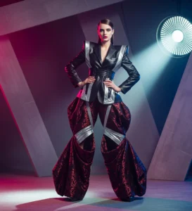 Visual style makes design special through the mixture of things like color, fonts, and layout to drive a nice look and grab attention. A designer will need to know basic design rules such as balance, contrast, and unity to build up strong visual style. These are quite important in making them attractive and effectively delivering the message intended.
A good visual style adds depth and interest to design. Designers could make designs interesting and appealing, using shapes, colors, and textures. Balance all of these so everything fits well together, and the design will turn out great; that is, it will look good and clearly get its message across.
The Power of Color Theory
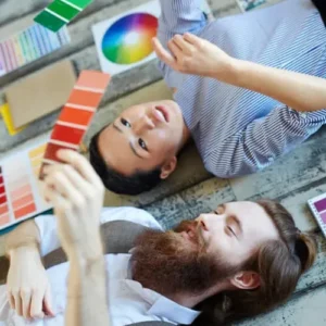 Color plays an important role in design, and color matching determines a lot between a good look and feel. Color theory helps the designer to identify which colors will work together and better help convey the feeling. Knowledge of this theory improves the visual style of designs so that they should be attractive and clearly deliver the message intended.
Color theory categorizes colors of the color wheel into three: primary, secondary, and tertiary. Primary colors include red, yellow, and blue; these are colors that cannot be made from other colors. Secondary colors, which come from mixing two primary colors, include orange, green, and purple. Tertiary colors are created by mixing primary and secondary colors and include yellow-green and blue green. Knowing these groups allows designers to create color schemes that refines visual style and beauty, thus making designs appealing yet effective in their message delivery.
Fonts and Their Role in Visual Style
Typography
Typography is part of a design and is very important because the key factor is choosing the right font. The font is the style of the letter, number, and symbol. Basically, there are different sorts of fonts. Serif fonts are fonts whose letters have small lines at the ends. They are attached at the top and bottom of the letters, giving them a look which is really classic and formal within the text. It is easily readable to the sight in print and can be found in books, newspapers, and other formal documents because of their classic look.
Those types of alphabets that do not have small lines or decorations, known as serifs, on their ends. Such fonts are clean and modern, with smooth, straight edges. People like them because of their simplicity and clarity for screens and modern design.
Script Fonts
Script fonts are those that resemble the appearance of handwritten letters. They contain smooth, flowing, connected letters with good curves and variations in thickness. This class of fonts introduces personal and artistic feelings in designs. They are good for invitations, greeting cards, and any project that needs a creative or formal style.
Display fonts
Display fonts are designed to take one’s attention and stick long in their minds. They are normally used for titles, posters, and advertisements, where the feel and look of the font matter the most. Display fonts will be distinct from the others because their specialty and boldness add more to the overall design or look.
In choosing a font, it’s important to take into consideration the message one wants to convey, the audience to view the font, and the aesthetics of the overall design. For instance, serif fonts are good for books and newspapers because they look classic and are easy to read. On the other hand, sans-serif fonts are usually better for websites and ads because they look clean and modern. Knowing each font type’s strong points allows the designer to choose an appropriate one for improving visual style, making it look good while clearly delivering the intended message.
Patterns and Shapes of Visual Style Elements
 Patterns and shapes are important design elements that add depth, structure, and visual interest. They guide the viewer’s eye, create balance, and bring energy to layouts. Patterns often rely on repetition to form texture and rhythm, while shapes can define space, highlight details, and strengthen composition. When combined thoughtfully, they transform ordinary designs into engaging and memorable visuals. Shapes can be of geometric form, such as circles or squares, or organic, like curves. Together, a mingling of different patterns and shapes results in a style that is incomparable in both aesthetic results and in effectively communicating one’s message.
A design is considered visually appealing if all parts work in harmony and contain only the necessary, well-matching visual elements for a look. The use of different patterns and shapes could develop style and appearance, making it more attractive and engaging. Too much variety may make the design appear cluttered and incomprehensible; that would lessen its total appeal and its effective use in communication.
Taking the Perfect Moment
Photography is an important skill for designers. It helps them make clear and appealing images. This includes setting up shots, controlling lighting, and focusing correctly. With creativity, designers can tell stories with their photos. They can also improve the visual style and beauty of the images, ensuring they look nice and clearly share the message.
Composition entails putting together the elements of an image in a manner that ought to look great. Lighting creates the mood and shows the main areas of the image. Focus defines how sharp and clear the photo would be. It is through these skills that the designers will take great photos, upgrade style, and clearly communicate their message.
Bringing Visual Style to Life
Drawing is among the important skills to designers, enabling them to create artwork that is an ongoing narrative or conveys information through pictures, paintings, and other digital images. In fact, with practice, designers will be able to do amazing work and show your ideas clearly.
Making good illustrations needs both technical and creative skills, such as drawing, making digital art, and telling stories. When these skills work together, they help designers create artwork that is appealing and engaging. For successful illustration, it’s important to keep a consistent visual style and theme, avoiding too many elements that can make the design look cluttered.
How Visual Style Turns Ideas into Reality
 Graphic design involves the creation of pictures, such as logos and icons, to convey messages and identify brands. It is a balance between technical skills and creativity, like ideation and narration. When designers build these skills, it is possible to construct visuals that clearly communicate information and are aesthetically pleasing.
A good graphic design combines different parts to make something that looks nice and clearly shows its message. Keeping a steady visual style and theme makes the design interesting. Good designs are simple and strong, staying away from too many details to keep the focus clear and powerful.
Crafting a Narrative through Design
Visual storytelling tells a story or shares information using pictures, drawings, and charts. It needs both technical skills, like using design software and following design rules, and creative skills, such as having a good eye for vision and arrangement.
Good visual storytelling assembles these components into an interesting storyline. Ensuring the simplicity and strength of the elements, rather than their number, makes for an appealing and comprehensible storyline.
Mood Boards and Mood Swings
A mood board is a design tool that shares ideas through images, colors, and textures, helping designers shape their concepts. It makes designers motivated and consistent in the style and theme of their design.
College, sketching, or digital methodology can support mood boards. This board is supposed to clearly indicate the idea of maintaining consistent looks and styles. It’s very important that it does not have too much on the mood board to keep off the messy appearances.
Elevating Your Creative Vision
 Designing is about making visuals that are nice to look at and clearly share a message. The technical part involves using design software and following design rules, while the creative part is about having ideas and telling stories. Getting good at both helps designers make attractive and interesting designs using things like color, fonts, and layout, which improve visual style and beauty.
Conclusion
In conclusion, good design therefore balances technical expertise with creativity as it creates visually pleasing and communicating graphics. Key elements of color, font, pattern, and shape can polish visual design style and appeal. Mood boards and visual storytelling help designers stay consistent. They make designs more engaging. The real challenge is balance. Simplicity and impact must work together. Designs should be clear, uncluttered, and easy to comprehend.
Read Next: The Ultimate Guide to Effective Commercial Photography


_converted")