In today's digital age, product photography has become a crucial aspect of any business. With…
A Simple Guide to Product Photography
This is the ultimate guide in taking product photos for your online business. Discover how to prepare your products before taking photograph.
The photographer is running late; the designer is fully booked, and your regular consumers are eagerly anticipating the arrival of new products.
The products are here, but there are no photographs of them.
Does this ring a bell? – Don’t be concerned! Breathe!
It’s true that you may have professional-looking product photographs without spending a dime.
Do it on your own!
Here are some practical tips on how to photograph your own products for your online store.

CHAPTER 1: Use the Sun as a Light Source
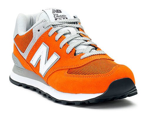
Don’t you think this is a really professional-looking product image?
Believe it or not, it wasn’t shot in a studio with several flashes and strobes, but rather in a well-lit room on a sunny day.
Still don’t believe me? Take a look at the next page for a photo of our ultra-professional studio…
See? The light comes from two windows on opposite sides (and yes, that is a white bed sheet spread over an old CD rack). There aren’t any fancy flashes or strobes here.
The trick is to use the sun as an indirect light source to brighten up the entire room, instead of shining a direct light on the product than taking a photo of it.
This is why photographing your goods near a window or in a shady outdoor area with natural sunlight produces the finest results. If the light near your window is still too strong, you can always diffuse it by covering the window with sheets or curtains, like we did (don’t diffuse the light with anything other than white, as colorful material will naturally affect the hue of light that streams through).
Using existing light allows you to take photos almost anywhere as long as there is sunlight. You won’t have to invest money in equipment or devote time and effort to set it up. As a result, it’s the ideal light source for all busy eCommerce company owners.
If you’re shooting many shots of the same thing, be sure they’re all taken around the same time. Depending on the time of day, the amount of light and even the color of the lighting change. Morning light is generally bright and has fewer colors, whereas afternoon/evening light has a warm undertone and brings forth more contrast in your photographs. You may always make the image neutral by removing the color.
TIP: Keep an eye on where your shadows fall, as some shadows may obscure some of the details in your products. If you use a window with grills or blinds, you may get undesired shadows.
TIP: Take your photo during the brightest part of the day (typically between late morning and early afternoon), when the sun is the brightest and shines enough lighting near windows or in the shade.
CHAPTER 2: Use a Variety of Light Sources
You must light both your goods and the overall shot for a professional-looking photo. Multiple light sources are required, but top-of-the-line strobes and flashes are not required. Reading or desk lamps, especially if they’re adjustable, are a terrific source of artificial lighting because you can point them wherever you like.
To light up the entire shot, shine one light on your product and one on the ceiling. If you have adequate natural light in the room, then you only need the light that shines on the product. And in a well-lit area, your camera’s flash will probably suffice.
Try photographing your product with various light source combinations and from various angles to find what works best for your product – this will most likely vary depending on the product, so some experimenting may be required. Mixing warm and cool light sources, on the other hand, will complicate your camera’s white balance calibration (we’ll explain more about this later).
TIP: Avoid using ceiling lights since they typically cast harsh shadows.
CHAPTER 3: Make Sure that Your Camera is Stable
If you’re new to photography, tripods are typically used to prevent camera shake. Even the steadiest hands can’t create pin-sharp shots, especially when the lighting is poor or you’re taking a close-up.
No tripod? No problem!
To stable your camera, you don’t need an expensive, complex tripod. Any firm, even, and the stable surface will suffice. Small tables and hard floors are ideal, or be creative and construct a book tower. A tripod, even if it’s a fairly simple and cheap one, is an excellent purchase if you shoot product photography on a regular basis (remember: product images, not crazy action shots in the great outdoors).
I set up a DIY box tripod to show you that it’s doable, even though we generally shoot our product photographs on a tripod. To make it look even more professional, I covered it with an oh-so-fancy box tripod cloth.
TIP: Set the camera to a two-second timer mode once you’re satisfied with your exposure and frame because this will give the camera enough time to stop wobbling when you push the shutter button.
TIP: Mark a spot for your camera, a spot for your subject, and, if you’re using any artificial light sources, a spot for each light source if you’re taking many shots of the same thing. You will get consistent photos as a result of this. Clear tape, in my experience, works rather nicely.
CHAPTER 4: Use a White Backdrop for Your Photo
You’re probably asking why we spent so much time setting up a white backdrop when we’re going to delete it any way.
To begin with, erasing the background is significantly easier if you shoot on white.
Second, you can get a natural shadow if you want to add some life to your product.
TIP: To create a smooth transition from the wall, I recommend using cloth rather than cardboard for your backdrop.
Third, whereas white reflects white light back onto your goods, darker hues absorb it.
When photographing jewelry on a black display bust, you may run across this problem. They are usually black since it makes the goods shine out in real life and makes the piece look more exquisite.
For the same reason, many people use a black background for their product photos on their websites. Black that displays busts should be reserved for the real world; if you want black on your website product photos, take your photo against a white backdrop and then convert the background to black on the computer.
If you look at the photographs below, you’ll see that the product looks a lot better on white.
TIP: Cover your black bust with a white cloth if you only have one.
Finally, you would want the white balance calibration on your camera to be as precise as possible. Have you ever taken a product photo and noticed that the color is off?
Light sources are rarely pure white; they typically have a slight ‘color temperature’ that affects the shot and can result in a strange tint that doesn’t precisely reflect the product’s true color. If you photograph a piece of paper with a candle, for example, the warm illumination will cause the paper to appear slightly yellow. Because the sun emits slightly blue light, a photo of the same piece of paper taken in natural light will appear bluer.
Our brains are able to adjust to varied light naturally and process these colors for us, and this color temperature is measured in ‘Kelvin.’
Going back to our piece of paper, we can see that it is white whether we are indoors or by candlelight. A digital camera, on the other hand, can only estimate. If you set your camera to ‘Auto White Balance,’ it will calculate the Kelvin number using a white element in the photo as a reference point. To make the colors more accurate, you can manually alter your white balance settings. Regardless of whether you’re using sunshine or candlelight, the sheet of paper should seem white if you adjust them properly.
Always check to see if the colors in the photograph are the same as they are in real life. You can always change the temperature of the photo later in Photoshop or any other photo-editing software if you’re not a camera expert or if you’re using a simple smartphone camera instead of a DSLR. For product photography, even something as simple as iPhoto provides a decent temperature adjustment option.
On a DSLR, there are eight (8) different white balance options: auto, cloudy, daylight, flash, fluorescent, tungsten, and custom.
The photographs below show how the custom white balance (which truly portrays the product’s true color) and the auto white balance settings compare. This is due to the fact that we exclusively employed natural lighting sources and a white backdrop, resulting in very accurate white balance calibration.
CHAPTER 5: Understand the Basics of Aperture, ISO, and Shutter Speed
If you’re new to photography, here’s a quick primer on aperture, ISO, and shutter speed: The aperture is measured in f-stops and determines the amount of light that enters the camera. The smaller the f-stop value, the larger the aperture.
Your depth of field, which defines how much of the image is in focus, is closely related to your aperture.
Photographers frequently experiment with aperture to separate their foreground from their background; a larger aperture (lower f-stop number) does this by making the foreground sharp and the background fuzzy.
When doing product photography, you should use depth of field to ensure that the entire thing is in focus, not to aesthetically differentiate the foreground and background.
A shutter speed between f/6 to f/8 is usually sufficient for capturing a sharp image of the entire product.
However, your results will be influenced by your lighting setup; if your product is too dark due to poor lighting, try shooting with a larger aperture (a lower f-stop number), though you may find that not all of the products are in focus, in which case you may need to experiment with other settings or the positioning of your product, lights, and camera.
Don’t be concerned if the background appears blurry because this is common when shooting with a large aperture. Keep in mind that the focus should be on your product, and you can easily remove the background in post-production.
The ISO, on the other hand, affects how light-sensitive your camera is; the higher the ISO, the more sensitive your camera is. The ISO values are in a geometric sequence, with each value doubling the value before it (i.e., 100, 200, 400, 800, 1600, 3200, 6400, etc..). This means that as you increase the number, the sensitivity likewise doubles.
For improved image quality, you should always strive for a low ISO of no more than 400. As you climb higher, the photo will become grainier. With a lower ISO, however, you must ensure that your product is well lighted, whether using natural or artificial light (or a combination of both).
Finally, the shutter speed refers to how long the camera shutter remains open, exposing the camera sensor to light. Shutter speeds that are faster are generally coupled with higher ISOs to generate crisper photos. And, because you desire a low ISO, your tripod will come in handy: with a stabilized camera, you can shoot at a slower shutter speed without getting a fuzzy photo. I normally aim for a shutter speed of roughly 1/50th of a second or faster.
Because so much depends on your lighting setup, it’s difficult to give exact values for the ideal settings, but if you’ve done your best to light up the product and the photo space, use a shutter speed of at least 1/50th of a second to keep the image sharp, an ISO of 100 to 400 to keep image noise to a minimum, and an aperture of anywhere between f/4 and f/8 to ensure your entire product is perfectly in focus.
TIP: If your set-up is lit well enough and you’re getting dark photos, you should increase your aperture (lower your f-number) before changing the ISO and shutter speed.
CHAPTER 6: Don’t Over-Edit
Consider yourself in your customer’s shoes: what if you ordered something online and received something completely different? Isn’t that disappointing?
You’d probably return it, vent your frustrations on social media, cry, vow to never buy in that store again, or do a combination of all four.
Don’t ruin your product image with too much editing to prevent misrepresenting your product.
Make minor image adjustments with photo-editing programs, such as adjusting the exposure, contrast, sharpness, and brightness, but don’t go crazy. In this case, less is absolutely more. Only utilize the very minimum of editing tools since the more you do, the lower the photo’s quality becomes. Don’t over-contrast the photo with cheesy filters, and don’t over-decorate it with goofy borders and colored writing.
The image below is an illustration of what NOT to do, and it was difficult to make and far more difficult to upload.
Not only does the text on that image seem bad, but the contrast and brightness settings have been over-adjusted as well.
Many people take photos against a white background and then try to eliminate it by adjusting the brightness and contrast levels until they match the white on a computer screen. This will make your products seem bad, and getting an exact color match will be difficult. Remove the background entirely if it really bothers you. I guarantee that your product image will be considerably more professional as a result of my efforts.
CHAPTER 7: Keep Your Background Simple
One rule of product image backdrops is that they should not compete with the product or distract the consumer from it.
The background of a product image can have an impact on the overall ambiance. Consider a smartphone commercial in which the product is shown on a cluttered desk. Despite the smartphone’s capabilities, you wouldn’t link it with an orderly lifestyle among a jumble of pens, scrunched-up paper, and used coffee mugs.
Allow your product to speak for itself by using solid-colored backgrounds, whether you shoot on a simple backdrop or add the background in post-production.
Any eCommerce platform or website design, as well as any product, will look great with a white background. This is vital because, while a blue background may look wonderful with one of your products, it may clash with another; you’ll have to select between inconsistent images or aesthetically terrible photos if you don’t do this.
Second, shoot a few close-up shots to illustrate the texture of your product, as well as any unique features or design aspects.
When it comes to selling apparel, shooting the item on a human or a mannequin is a terrific idea because it allows the client to imagine how the item will look when worn, as opposed to using flat lay images.
Keep in mind that the ‘hero image,’ whether it’s the only photo available or the first in a series, should be a straightforward photo of the object on its own, with no distractions. You want your website visitors to understand exactly what you’re selling. Do you think this photo is relevant to the product you’re selling? Does it draw attention to the product’s most important features? It is true that a picture is worth a thousand words – but only if it is the proper picture.


