A great professional headshot editing tips is important for making a good first impression, even…

Create Stunning Product Labels in Photoshop
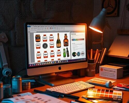
Creating stunning product labels in Photoshop is an essential skill for any designer, graphic artist, or entrepreneur. With the right tools and techniques, you can design labels that not only capture attention but also effectively communicate the brand’s message. In this article, we will guide you through the process of creating a product label in Photoshop, from setting up your workspace to adding the final touches.
Understanding the Basics of Product Label Design
Before diving into the design process, it’s essential to understand the basics of product label design. A product label typically includes essential information such as product name, brand name, ingredients, and instructions for use. The label should also include visual elements that make the product stand out and appeal to the target audience. When designing a product label, consider the product’s purpose, target audience, and the brand’s overall visual identity. This will help you create a design that effectively communicates the product’s message and resonates with the target audience.
When designing a product label, it’s crucial to keep in mind the physical constraints of the label. Consider the size, shape, and material of the label, as well as the space available for text and visual elements. This will help you create a design that is both visually appealing and functional. ensure that your design meets any regulatory requirements, such as including necessary warnings or disclaimers.
Setting Up Your Workspace in Photoshop
Once you have a clear understanding of the design basics, it’s time to set up your workspace in Photoshop. To begin, create a new document in Photoshop with the desired dimensions for your label. For a standard label, a rectangular shape with a width of 2-3 inches and a height of 1-2 inches is a good starting point. Set the resolution to 300 DPI and the color mode to RGB. This will ensure that your design is high-quality and suitable for print or digital use.
Next, create a new layer for your design and set the background color to a neutral shade, such as white or gray. This will provide a clean canvas for your design. Consider creating separate layers for text, visual elements, and background elements to make it easier to edit and adjust your design.
set the font and font size for your design. A sans-serif font such as Arial or Helvetica is a good choice for product labels, as it is easy to read and versatile. Set the font size to a range of 10-12 points, depending on the size of your label.
Choosing the Right Fonts for Your Product Label
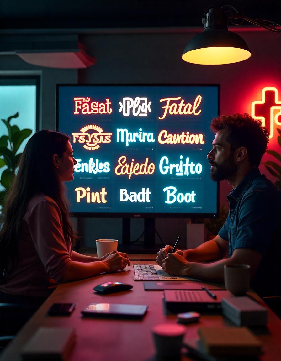
Choosing the right font for your product label is crucial for effective communication. The font should be easy to read, even from a distance, and convey the brand’s personality and tone. When selecting a font, consider the product’s purpose, target audience, and the brand’s overall visual identity.
For a more modern and sleek look, consider using a sans-serif font such as Arial, Helvetica, or Futura. For a more traditional or vintage look, consider using a serif font such as Times New Roman, Garamond, or Bodoni. Avoid using overly decorative or stylized fonts, as they may be difficult to read.
When choosing a font, also consider the font size and spacing. Ensure that the font size is large enough to be easily read, but not so large that it overwhelms the design. Pay attention to the font spacing, as well, ensuring that the letters and words are properly aligned and spaced.
Designing the Perfect Shape for Your Label
Designing the perfect shape for your label requires careful consideration of the product’s purpose, target audience, and the brand’s overall visual identity. A standard rectangular shape is often effective for product labels, as it provides ample space for text and visual elements. If you want a more unique look, try using an unusual shape for your design.
When designing a non-standard shape, consider the product’s packaging and the space available for the label. Ensure that the shape is functional and easy to apply or remove. For example, a circular shape may be effective for a bottle or jar label, while a rectangular shape may be more suitable for a package or box.
ensure that your design is scalable and looks good in various sizes and orientations. This will ensure that your label design is versatile and effective, regardless of the product’s size or packaging.
Adding Text and Visual Elements to Your Design
Adding text and visual elements to your design is crucial for creating a stunning product label. Text elements include the product name, brand name, ingredients, and instructions for use, while visual elements include logos, images, and graphics. When adding text elements, ensure that they are easy to read and prominently displayed.
For visual elements, consider using a combination of colors, shapes, and textures to create a dynamic and eye-catching design. For example, a logo or image can be placed in the center of the label, while text elements are placed around it. Avoid cluttering the design with too many visual elements, as this can make it difficult to read and overwhelming.
When adding visual elements, also consider the product’s packaging and the space available for the label. Ensure that the design is functional and easy to apply or remove. For example, a label with a large image or graphic may not be suitable for a small package or bottle.
Working with Colors and Contrast in Photoshop
Working with colors and contrast in Photoshop is essential for creating a stunning product label. Colors can be used to draw attention, create emphasis, and convey the brand’s personality and tone. Contrast is also crucial for creating a visually appealing design, as it helps to separate text and visual elements and create visual interest.
When working with colors, consider the product’s purpose, target audience, and the brand’s overall visual identity. For example, a product targeting children may use bright, bold colors, while a product targeting adults may use more muted, sophisticated colors.
When creating contrast, consider using a combination of light and dark colors to create visual interest. For example, a dark background with light text can create a striking contrast, while a light background with dark text can create a more subtle contrast.
Adding Texture and Patterns to Give Your Label Depth
Adding texture and patterns to your label design can give it depth and visual interest. Texture can be added using the “Texture” filter in Photoshop, while patterns can be added using the “Pattern” filter or by creating your own custom pattern.
When adding texture or patterns, consider the product’s material and the packaging. For example, a label with a wood grain texture may be suitable for a wooden package or bottle, while a label with a metallic texture may be more suitable for a package or bottle with a metallic finish.
Avoid overusing texture or patterns, as this can make the design look busy and overwhelming. Instead, use them sparingly to add visual interest and depth to your design.
Final Touches: Saving and Exporting Your Label Design
Once you have completed your label design, it’s time to save and export it. In Photoshop, go to “File” > “Save As” and choose a file format such as JPEG or PNG. Ensure that the resolution is set to 300 DPI and the color mode is set to RGB.
When exporting your design, consider the intended use of the label. If the label will be used for print, ensure that the resolution is high enough and the file format is suitable for printing. If the label will be used for digital use, such as a website or social media, a lower resolution may be sufficient.
proofread your design carefully to ensure that it is error-free and meets your standards. Make any necessary adjustments, and then save and export your design.
Creating a stunning product label in Photoshop requires careful planning, attention to detail, and a good understanding of design principles. By following the steps outlined in this article, you can create a label design that effectively communicates the product’s message and resonates with the target audience. Whether you’re a designer, graphic artist, or entrepreneur, the skills and techniques outlined in this article will help you create stunning product labels that stand out in a crowded market.
Conclusion
In conclusion, designing a product label in Photoshop requires a mix of creativity and attention to detail. By choosing the right fonts, colors, shapes, and visual elements, you can create a label that effectively communicates your brand and catches the eye of customers. Whether you’re designing for print or digital use, following the steps in this guide will help you craft a label that stands out and enhances your product’s appeal. With practice and patience, you can master the art of product label design in Photoshop.
Read Next: Launch Your Dream Photography Studio Today


