If you're a photographer looking to make money from your work, online selling sites are…

Transform Your Images with the Best Color in Photo Editing
Color is one of the most powerful tools in photo editing. It can change the mood of an image, making it feel either more lively or peaceful, depending on how you use it. By understanding color basics, such as how different shades work together, you can enhance your photos and make them stand out. Simple adjustments like adding bold colors, creating contrasts, or using gradients can take your photos from good to great. Transform your images with the best color and watch them come to life.
Using color helps you focus on the important parts of your photo, making specific details or subjects stand out. Adjusting the white balance helps make the colors look natural, while filters can give your images a unique twist. Using monochromatic colors or gradient maps can add a creative touch and bring new life to your work. With these techniques, you can turn any photo into something memorable by unleashing the best color.
Learn Color Basics
 Learning the basics of color is a key step in improving your photo editing skills. Color is a powerful tool that can change the mood and style of your images. When you understand the basics of color, you can make better choices while editing and get the results you want. The three main components of color are hue, saturation, and brightness. Hue refers to the actual color, like red or blue. Saturation describes how intense or dull the color is, and brightness refers to how light or dark the color appears. Knowing how to adjust these elements can help you highlight details or create different effects in your images. Transform your images with the best color by learning these basics.
Color theory helps you understand how colors work together and interact. It explains things like complementary colors, which are opposites on the color wheel, such as blue and orange. When placed next to each other, they create a strong contrast. Analogous colors, which are next to each other on the wheel, like blue and green, create a more harmonious and smooth look. Knowing these relationships helps you pick colors that either stand out or blend smoothly, depending on the look you want in your photo.
Learning color basics also means understanding how colors affect the feeling of your images. Warm colors, like red, orange, and yellow, can make a photo feel lively and energetic. On the other hand, cool colors like blue and green tend to create a calmer, more peaceful atmosphere. By adjusting the colors in your images, you can evoke the mood you want to share with your audience. Once you understand these color principles, you’ll be able to make your images look better and more appealing.
Use Bold Colors
 Using bold colors in your images can make them stand out and grab attention. Bold colors are bright, vibrant, and full of energy, which can help your photo make an impact. When you add bold colors to certain parts of your image, they draw the viewer’s eye directly to those areas. For example, a bright red object in an otherwise neutral scene will immediately stand out. By strategically placing bold colors, you can create focal points that make your image more dynamic and engaging.
Bold colors also allow you to express strong emotions and moods. Red, yellow, and orange are bright and energetic, while blue and green are calming but still noticeable. When you use these colors in your photos, they can convey a message or feeling without needing many other elements to do the work. The right bold color can give your image a fresh, modern look or a lively, dramatic touch, depending on how you apply it.
In photo editing, you can increase the saturation of certain colors to make them bolder. This can make a subtle color more striking and help it stand out more in your composition. However, it’s important not to overdo it. Too much bold color can make the image feel overwhelming. The key is balance use bold colors where they matter most and keep other areas more neutral to create a well-balanced photo. When used carefully, bold colors can make your images stand out and leave a lasting impact. Transform your images with the best color by carefully applying bold colors in a balanced way.
Set the Mood with Colors
 Colors can have a strong influence on the mood of your image. By using different shades and tones, you can create a specific feeling or atmosphere. For example, warm colors like red, orange, and yellow tend to make a photo feel more energetic and lively. These colors can give off a sense of excitement or warmth, making the viewer feel engaged and connected. On the other hand, cool colors like blue, green, and purple often create a sense of calm or peacefulness. These colors can make your photo feel more relaxed, inviting a sense of tranquility.
When editing your images, you can adjust the color temperature to change the overall mood. If you want a more energetic or warm atmosphere, you can add warmer tones to your photo. This can make a simple image feel more vibrant. Conversely, if you want a cooler, more relaxed feel, you can adjust the image to include more blue and green tones. Small tweaks like this can help bring out the feeling you want to express, just by adjusting how the colors are balanced.
Using color to set the mood works for many types of photos, like portraits, landscapes, or abstract shots. A sunset might use warm reds and oranges to show the day’s end, while a beach scene uses cool blues and greens to show the calm ocean. By understanding how color controls the mood, you can make your photos stronger and help the viewer feel more connected. Transform your images with the best color by adjusting colors to match the mood you want to create.
Create Focus with Color
 One of the most effective ways to draw attention to a specific part of your image is by using color. By adjusting colors, you can guide the viewer’s eye to the key elements of your photo. For example, if you have a busy background, using a bold or contrasting color on the subject can help it stand out. A bright color like red or yellow can make a subject pop, making it the focal point of the image. This technique ensures that the viewer immediately knows where to look first.
You can also use color contrast to create focus. Pairing complementary colors, which are opposite on the color wheel, can make objects stand out against their surroundings. For example, placing a green object against a red background can draw attention to the green object, making it the main focus. Small changes in color can help guide the viewer’s eye to a certain spot, adding depth and making it stand out.
In addition to color contrast, you can also use color isolation to draw focus. By muting or desaturating the surrounding colors in your photo, the bright, bold areas will naturally stand out more. This method is great when you want to highlight something in your photo, like a flower in a field or a person in a crowd. By controlling the colors in the image, you can make the focus stand out and make your photo more interesting and powerful. Transform your images with the best color by using these techniques to make your subject stand out and grab attention.
Add Depth with Gradients
 Gradients are a powerful tool in photo editing to add depth and dimension to your images. A gradient is a gradual change from one color to another, which can create the illusion of space and distance. By using gradients, you can make flat images appear more three dimensional. A gradient from dark to light can make it seem like light is shining on an object or scene, adding realism and life.
You can also use gradients to separate different parts of an image, which helps create layers and depth. For instance, using a gradient in the background can make the subject in the foreground stand out more. In portrait photography, a smooth gradient background helps the person blend into the scene without distractions. It helps direct attention where you want it while giving the photo a sense of space.
Another way gradients add depth is by enhancing the contrast between light and shadow. Applying a light-to-dark gradient across the image can create a more dramatic effect. This can make your photo feel richer and more interesting. Gradients can add depth and movement to landscapes or portraits, making the image look more realistic and polished.
Adjust White Balance
 Adjusting white balance is a key step in photo editing that helps make colors in your image look more natural and true to life. When you take a photo, the color of light can affect how the colors in your image appear. Sometimes, light can make your photo look too warm (with orange or yellow tones) or too cool (with blue or green tones). White balance adjustments fix color shifts, making white objects look white and other colors more accurate.
To adjust white balance, use presets like daylight, cloudy, or tungsten, or manually adjust the temperature and tint. For example, if your photo looks too warm, you can cool it down by adjusting the temperature slider toward the blue side. On the other hand, if it looks too cool, you can warm it up by moving the slider toward the yellow side. The goal is to make sure the colors in your image look realistic and balanced, especially in terms of white and neutral tones.
Fixing the white balance can change how your photo feels. When the colors look right, the photo is nicer to look at and feels more natural. But if the colors are off, the photo can look strange or hard to enjoy. Taking a little time to adjust the white balance helps your photo show the real colors and look better to others.
Use Color Filters
 Color filters are an easy way to improve your photos and set a certain mood. You can add them while editing to change how your photo looks and feels. For example, a warm filter with orange or red tones can make the photo feel lively and full of energy. A cool filter with blue tones can make it feel calm and quiet. These filters help show the feeling or message you want to share in your photo.
Most photo editing programs make it easy to use color filters. You can add a filter to the whole photo or just certain parts, depending on the look you want. Some filters make the photo’s colors stronger, while others add a new color layer to change the mood. For example, a sepia filter can make your photo look old or classic, while a blue filter can make it feel calm or sad. Filters are a great way to give your photos a certain look or feeling.
Color filters can also help fix color problems in your photos. If a photo looks too warm or too cool, a filter can help fix that. For example, if there’s too much yellow in the picture, adding a bit of blue can balance it out. This makes the photo look more natural. By trying different filters, you can improve your photo and give it a special look that makes it stand out.
Highlight Key Details
 Showing important parts of a photo helps draw the viewer’s eyes to what matters most. It makes the photo easier to follow and more interesting. For example, in a photo of a person, you might want to bring attention to their face or eyes. You can do this by changing the light, contrast, or colors to make those parts stand out.
In photo editing, there are many ways to make important parts of a photo stand out. One simple way is to change the brightness and contrast in certain areas. For example, making the subject brighter or darkening the background can create a spotlight effect. You can also change the colors, making the main part of the photo more colorful while keeping the background dull. This helps the viewer focus on the most important part of the image.
Another way to make important parts of a photo stand out is by using depth of field. This means making the background or foreground blurry so the main subject looks sharper and clearer. It’s often used in portraits to help the person stand out from what’s behind them. This trick can also be used in nature or building photos to guide the viewer’s eye and make the photo more focused and clear.
Try Monochromatic Colors
 Monochromatic colors are different shades of the same color used together in a photo. This helps the picture look neat and well matched. For example, you can use light blue in the background, dark blue for the main subject, and medium blue for some details. Using one color in different tones creates a calm, helping people focus on the main subject without distractions.
Using monochromatic colors also helps keep the image consistent. When everything in the photo uses similar colors, it looks neat and connected. This works well for simple designs or when you want the viewer to focus on the subject, not the background. By picking one main color and using its different shades, you can create a clean and thoughtful look.
Monochromatic color schemes are also a good way to set a mood or feeling. Light colors can make your image feel calm, while darker colors can make it feel more dramatic or serious. This method works for different types of photos, from portraits to landscapes. By trying different shades of one color, you can give your photos a special look and help tell a clearer story.
Use Gradient Maps
 Gradient maps are a helpful tool in photo editing that let you add a smooth color change across your image. This technique applies a gradual shift from one color to another to the different tones in your photo. By using gradient maps, you can create interesting color effects, change the mood, and add depth. For example, apply a warm gradient from yellow to red to highlight certain areas, while keeping others cooler. This draws attention to specific parts and adds a creative touch to your image.
Using gradient maps is also a great way to change the color balance of your image. You can use gradients to bring out certain colors, making your photo look warmer or cooler depending on the colors you pick. For example, a blue to purple gradient can cool down the image and give it a calm feeling. On the other hand, a gradient from orange to red can create a warmer, more lively mood. This lets you adjust the look of your image to match the feeling you want.
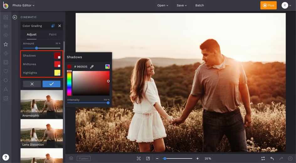
In addition to changing the mood, gradient maps can also add depth and texture to your images. By applying a gradient to the shadows, midtones, and highlights separately, you can make the photo look more 3D. This technique creates contrast between light and dark areas, making the image feel richer and more dynamic. Gradient maps let you experiment with colors and effects, giving you more control over your photos’ look and feel.
Conclusion
Using color and gradients in photo editing can help guide how people see and feel about your images. Simple changes in color or light can highlight important parts, add feeling, or bring more life to your photo. By learning how colors work together and how to adjust them, you can make your photos look more real and pleasing to the eye.
Gradients and white balance are great tools for adding depth and improving your photos. Gradients can separate different parts of the image, making flat pictures feel more lively. White balance fixes colors that may look too warm or cool, so everything looks more natural. With practice, these tools can help make your photos clearer, more balanced, and more interesting.
Related Posts


Comments (0)