Taking beautiful jewelry photos for ecommerce can help you sell more items online. Clear, bright,…
How Brilliant Color Choices Boost Jewelry Photography
Jewelry photography is an art that requires an understanding of both technical skills and creative choices. One of the most important factors in creating striking jewelry images is the use of color. From choosing the right background to adjusting lighting and making post-processing adjustments, brilliant color choices play a pivotal role in how jewelry is perceived. This guide explores how color can improve your jewelry photography by considering psychology, contrast, color schemes, and more to make sure that your jewelry shines and stands out.
1. Understanding the Psychology of Color
Colors aren’t just about how things look; they can also affect how people feel. For example, gold often represents wealth and luxury, which is why it’s popular for fine jewelry. Blue, on the other hand, makes people feel calm and trustworthy. By understanding these meanings, photographers can choose colors that match the story they want to tell about the jewelry. No matter if it’s a diamond necklace or a blue gemstone ring, the right color can make a big impact.
It’s not just about the background either. The light used in photography can also change how jewelry looks. Warm light brings out the richness of gold and copper, while cooler light makes silver and platinum shine more. Knowing how different lights affect different materials helps you reveal the true beauty of the piece.
When photographing jewelry, consider how the colors of the jewelry match the background. A neutral background makes colorful gemstones stand out, while dark colors like blue or black make the piece look more elegant. Understanding how colors make people feel helps you make better choices for your photos and strengthens the message you want to send.
2. Matching Colors to Jewelry Materials
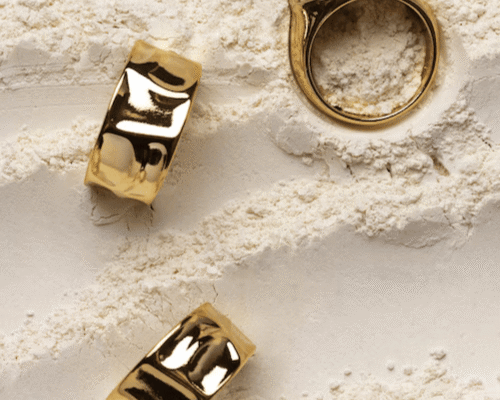
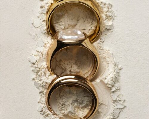
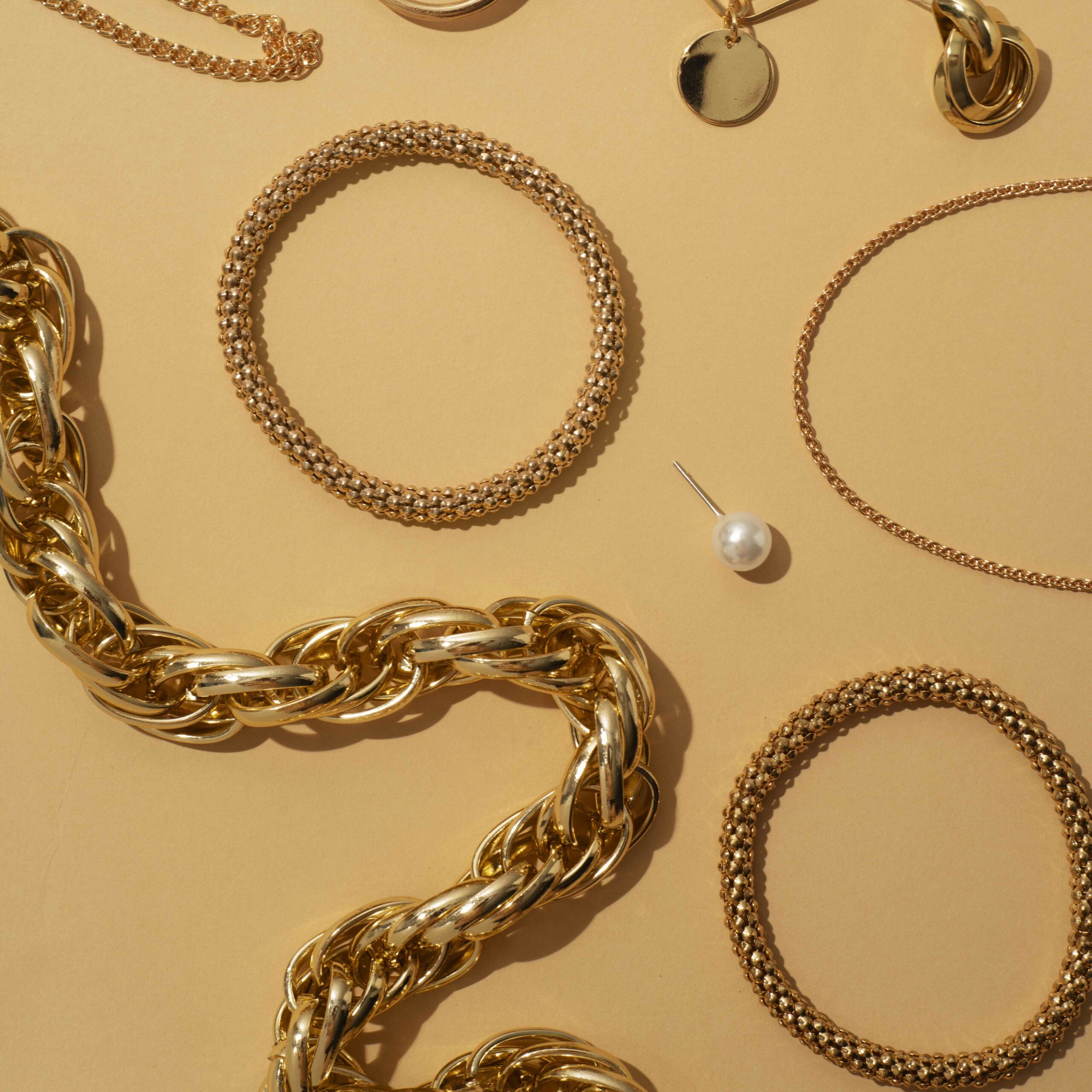
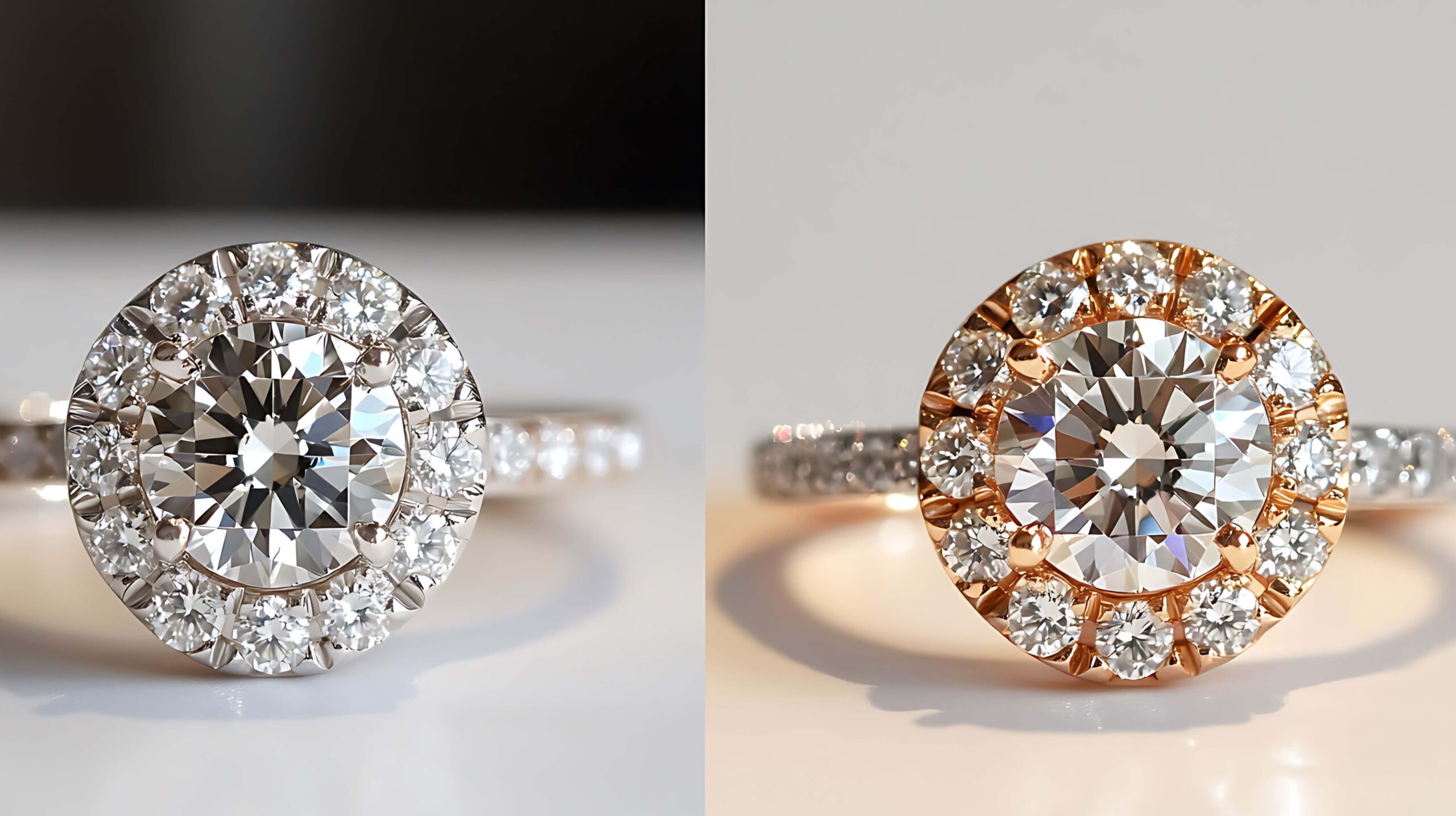
Different jewelry materials reflect light differently, so the background and lighting should match the jewelry. For example, yellow gold shines with a warm glow, so using warm colors like beige, brown, or red makes it look even better. Rose gold also looks great with soft, warm tones like peach or cream.
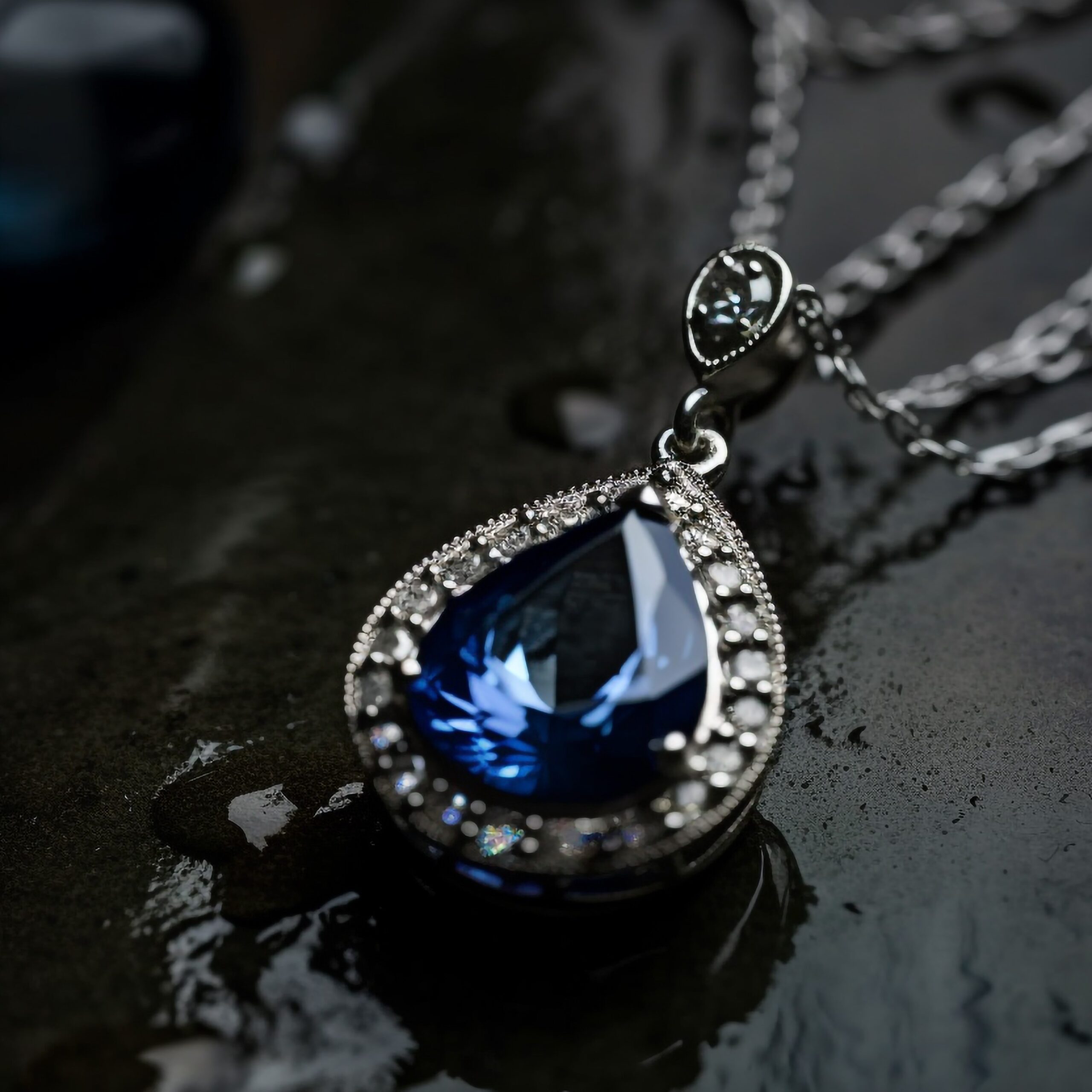
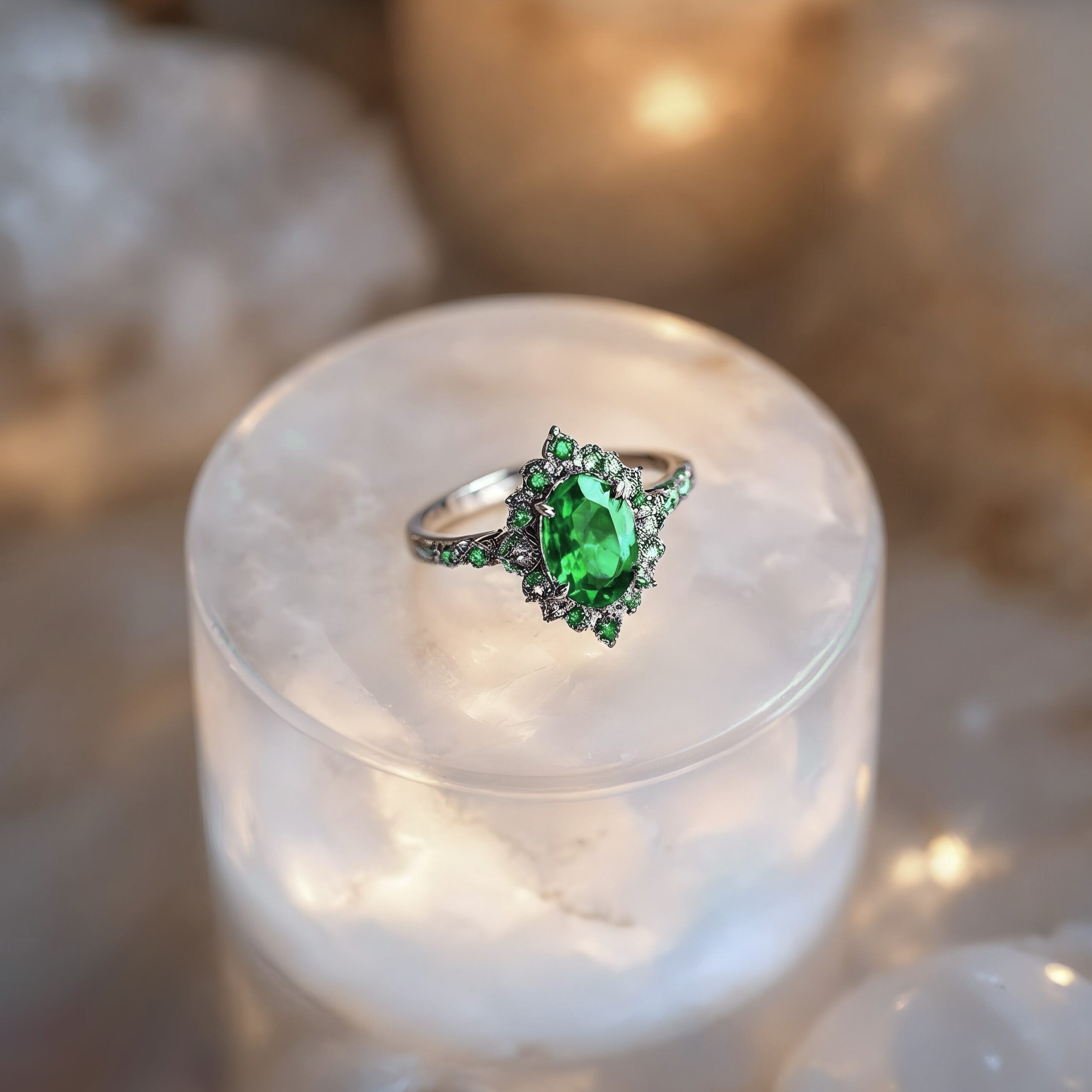
Platinum has a cooler tone, so it pairs well with cooler colors like silvery blues, grays, or white to improve its shine. For gemstones, the color of the stone matters too. Sapphires look great with dark blue or purple backgrounds, while emeralds stand out against rich green or neutral backgrounds that let their green color shine.
Brilliant color choices for the background can also affect the mood you want to create. Luxury jewelry often looks best in simple, simple settings, while fun, colorful pieces might look better with brighter or more playful backgrounds. The key is to choose colors that highlight the jewelry without overpowering it.
3. Creating Contrast to Make Jewelry Pop
One of the best ways to make jewelry stand out in a photo is by using contrast. Contrast helps separate the jewelry from the background, making it the focal point. For example, if you’re photographing a ring with a sparkling diamond, a darker background will create contrast and make the diamond’s light reflections pop, drawing attention to the piece.
Contrast isn’t just about light and dark; it’s also about color. Pairing colors like blue and orange or red and green creates high contrast and gives the photo a lively, eye-catching look. This works especially well with gemstones, as their colors can appear brighter against contrasting backgrounds. High contrast also adds depth, making the jewelry look more three-dimensional and polished.
However, it’s important not to overdo it with contrast. Too much can make the image look busy and distract from the jewelry. The key is to find a balance that highlights the piece without competing with the background. Experimenting with different contrasts can lead to creative shots, but gentle contrast often works best in jewelry photography.
4. Complementary vs. Analogous Color
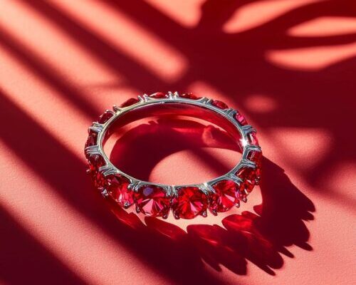
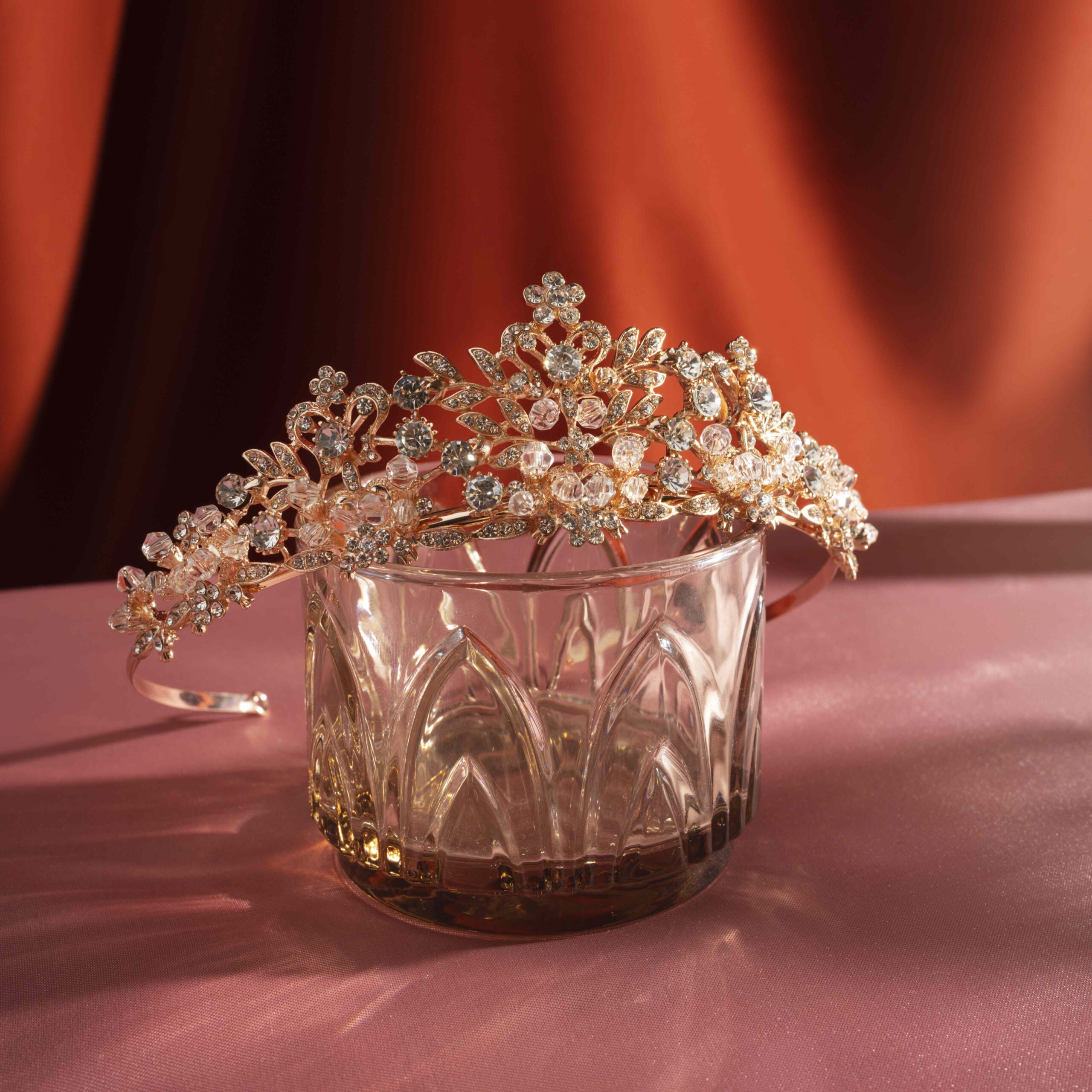
 Color schemes play a significant role in creating a cohesive look for your jewelry photos. Two common types of color schemes are complementary and analogous. Complementary color schemes use opposite colors on the color wheel, such as red and green or blue and orange. These color combinations create strong contrast and a bold effect, making them ideal for jewelry pieces that need to stand out. A ruby ring, for instance, could be paired with a green background to create striking contrast that draws attention to the rich red of the stone.
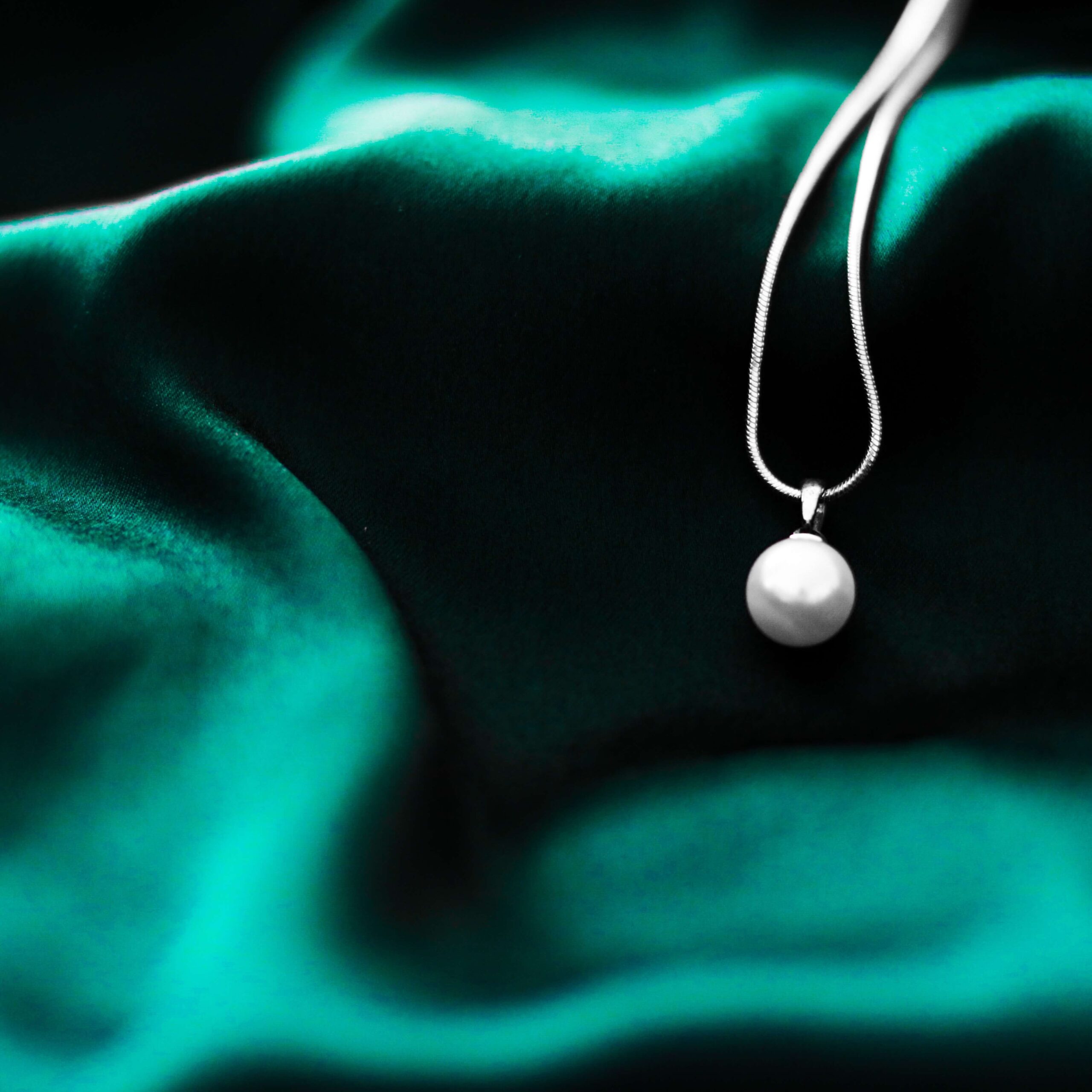
On the other hand, analogous color schemes use colors that are next to each other on the color wheel, such as blue, green, and teal. These combinations are more harmonious and calming, creating a softer, more unified look. Analogous color schemes are perfect for creating a more gentle, refined style that allows the jewelry to shine without being too visually overwhelming. For example, a sapphire necklace could be photographed against soft blue or purple hues, allowing the gemstone’s color to take center stage in a calm, understated way.
Understanding when to use complementary versus analogous color schemes depends on the feeling you want to evoke. Complementary color schemes create bold, eye-catching visuals, while analogous schemes give a calm, elegant feel. Picking the right color scheme helps make your jewelry photos look better and match the mood you want to share.
5. Color Grading in Post-Processing
 Color grading is an important step in post-processing jewelry photography. It means changing the overall look of the photo to create a mood or bring out the jewelry’s natural colors. By adjusting warmth, brightness, and contrast, you can make the jewelry look more vibrant based on the effect you want.
Color grading also helps tie a set of images together. When photographing a jewelry collection, using the same color style for all the images makes them look unified. For a high-end brand, a cooler, muted tone gives a sleek look, while a warmer tone adds energy and makes the jewelry stand out.
While color grading can significantly improve your jewelry images, it’s important to keep the jewelry’s true colors intact. Overdoing the grading can make the piece look unrealistic, which can be misleading for potential buyers. A gentle approach is key to achieving a professional, visually pleasing result that highlights the jewelry without distorting its true colors.
6. Highlighting Gemstone Colors
Gemstones often come in a variety of rich colors, and it’s important to use color strategically to highlight their natural hues. The lighting you use in your jewelry photography can have a major effect on how gemstones appear. For example, diamonds can reflect different colors depending on the lighting, while rubies have rich red tones that can be brought out with warm lighting.
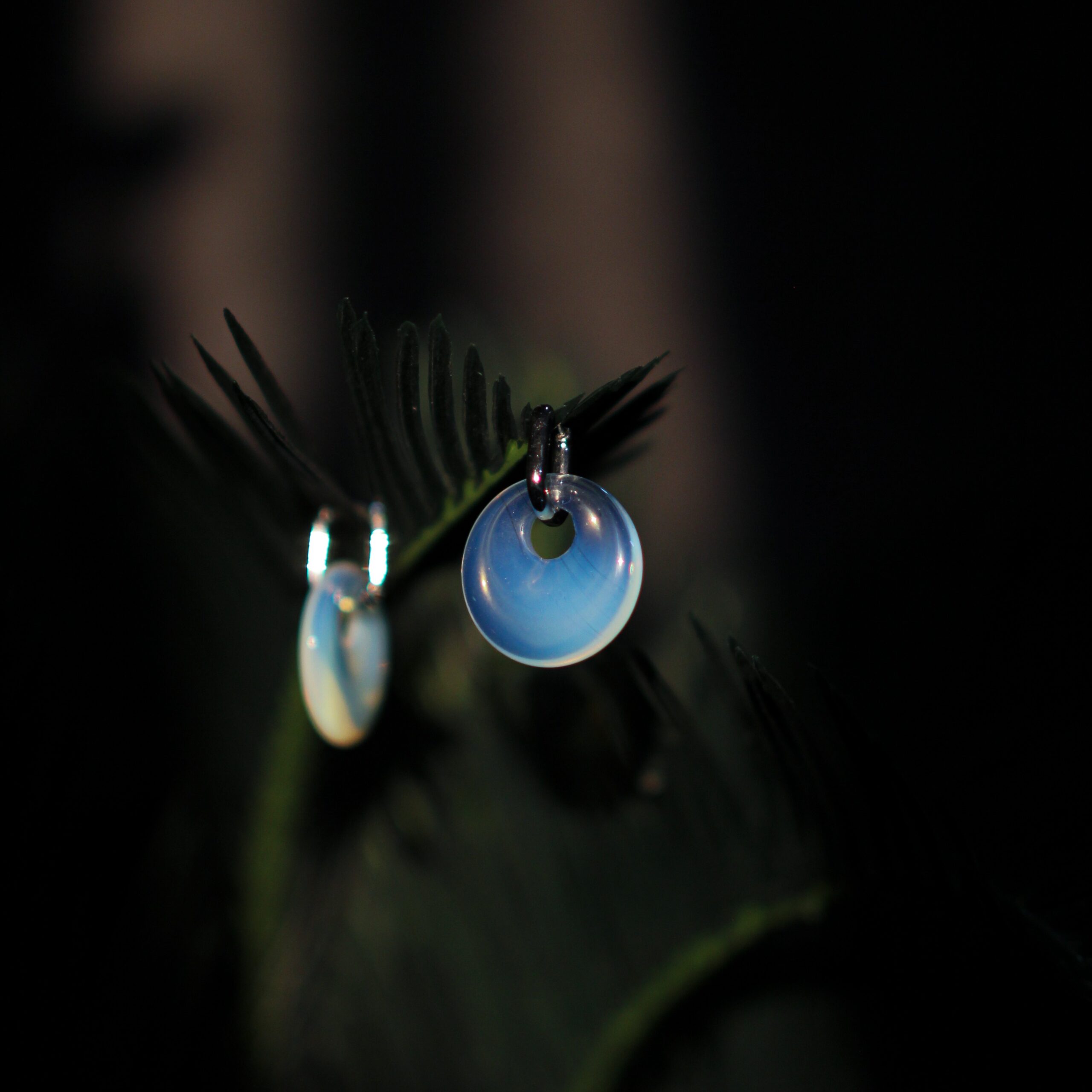
Background colors also play a role in showcasing gemstones. A dark background like black can make a rich emerald pop, while a lighter stone like aquamarine looks great against a white or soft blue background. The right background color helps show off the gemstone’s color, cut, and clarity.
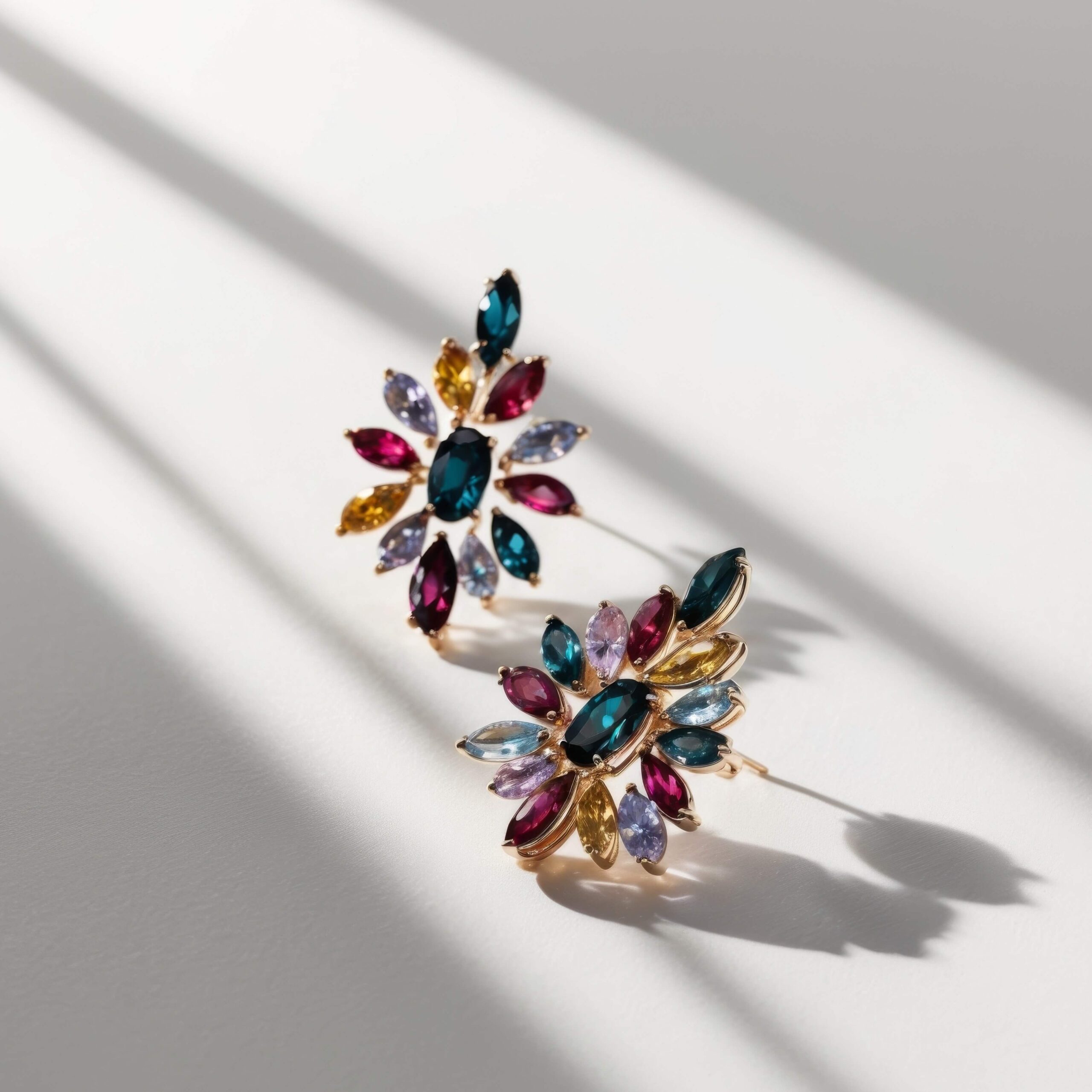
Gemstones with many colors, like opals or tourmalines, look best against neutral backgrounds so their colors stand out. The goal is to balance the stone’s colors with the background, keeping the focus on the gemstone without it getting lost in the surroundings.
7. Adapting Colors for Target Platforms
Different platforms have different needs for how images should look, and the colors you use can change how jewelry photos are seen. For example, social media images should be bright and eye-catching, while e-commerce sites need more natural, true-to-life colors to show the product accurately.
Print materials like catalogs or ads also need color adjustments because colors can look different on paper than on a screen. It’s important to calibrate the colors to make sure they print correctly. Understanding the image size, resolution, and color settings for each platform helps you get the best results.
By choosing the right colors for each platform, you make sure your jewelry looks great and sends the right message to your audience. If it’s for social media or e-commerce, knowing the platform’s needs helps you create professional images that fit perfectly.
8. Achieving Color Accuracy
 Color accuracy is important in jewelry photography, particularly when selling products online. Customers depend on images to decide what to buy, and if the color is wrong, it can lead to disappointment and returns. To ensure the colors are right, adjust the white balance and lighting to fix any color issues from the camera or surroundings.
In editing, tools like the eyedropper and HSL sliders help adjust the colors to match the jewelry’s real look. This is especially important for clear stones like diamonds or shiny metals, where small color changes can affect how the piece appears.
When editing images for online platforms, maintain color consistency across various formats. Achieving color accuracy is important not just for customer satisfaction but also for maintaining the professional quality of your jewelry photography.
Conclusion
In jewelry photography, color is more than just looking good. It helps make the jewelry more appealing and connects with the viewer. Understanding how colors affect feelings and creating contrast, photographers can take amazing photos that make the jewelry stand out. With careful color choices, photographers can make their work shine and show off the jewelry in the best way.
Read Next: Bright Gradient Backdrops to Highlight Your Jewelry
Related Posts